GeoData Visualization

Data Management

Data Management

Transform complex geospatial data into clear, impactful visuals with the Geo-ICT GeoData Visualization Course. This hands-on training gives you the skills to turn raw data into engaging stories using dashboards, maps, and charts—no matter the tool or industry. Designed for professionals who want to lead with clarity, the course blends visual thinking, practical techniques, and real-world application.

Course duration: 2 days

Taught by:

Peter Schols
English

GeoData Visualization

Geo-ICT Training Center, The Netherlands - GeoData Visualization

As digital data continues to grow at an unprecedented pace, so does the need to make it understandable, accessible, and useful. Raw numbers rarely speak for themselves. Instead, it’s how we visualize and interpret them that turns data into insight. This is why data visualization is a critical skill. It transforms complex datasets into visuals that reveal patterns, trends, and relationships at a glance.

Well-designed charts, maps, and dashboards leverage our brain’s natural ability to process visual information. Consequently, they help us spot issues, identify opportunities, and explain ideas more effectively than tables or spreadsheets ever could. Whether you’re monitoring environmental changes, analyzing customer behavior, or working with spatial data, visualization turns information into a powerful decision-making tool.

The GeoData Visualization Course from Geo-ICT is built to help you develop these skills from the ground up. You’ll learn how to select the right visual formats for different data types and design user-friendly dashboards. In addition, you’ll practice crafting compelling stories that capture your audience’s attention.

This course is software-agnostic, giving you hands-on experience with tools like QGIS, Excel, Power BI, and Cognos. As a result, you’ll be prepared to apply your skills in a variety of settings—from public policy and logistics to research and tech.

What will you learn

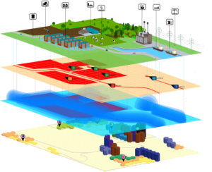
In this course, you’ll build a strong foundation in both the theory and practice of data visualization, with a special focus on geospatial data. Through hands-on exercises and expert-led sessions, you’ll learn how to identify data types—such as quantitative and qualitative—and choose effective visual strategies for each.

You’ll also apply essential design principles to ensure your visuals are clear and purposeful. Moreover, you’ll explore how to create interactive dashboards that allow users to explore data on their own. To guide users through your insights, you’ll practice storytelling techniques that turn data into narratives people can follow and trust.

Throughout the course, you’ll work with geodata tools and maps to visualize spatial data. At the same time, you’ll become familiar with a range of visualization platforms, helping you adapt your skills across software environments. By the end, you’ll confidently choose the right visual approach, avoid common pitfalls, and design visuals that help people make smarter, faster decisions.

Why choose this course

At Geo-ICT, we believe learning should be practical, engaging, and immediately useful. This course is designed for professionals who want to create visualizations that drive real understanding—not just pretty graphics.

  • Expert instruction from professionals with deep experience in geospatial data, visual analytics, and data storytelling
  • Hands-on training focused on creativity, experimentation, and real-world problem solving
  • Tool-agnostic flexibility with exposure to industry-standard platforms like Power BI, Excel, QGIS, and Cognos
  • Transferable skills you can apply across sectors, from government and business to education and research
Read more

Sign up


    Group Discounts:
    10% for 3 participants
    15% for 4 or more participants


    Prices are indicative and may vary by country. Feel free to reach out — we’ll gladly work with you to find a suitable arrangement.

    €1495,- Excl. btw

    €1495,- Excl. btw

    Course structure

    Day 1

    You’ll start by learning the foundations of data visualization—what it is, why it matters, and how the human brain processes visual information. You’ll explore different types of data and how to choose the most effective visual format for each. In the afternoon, the focus shifts to practical design skills: preparing data for display, applying visualization guidelines, and avoiding common design pitfalls that lead to confusion or misinterpretation.

    Day 2

    On the second day, you’ll dive deeper into the building blocks of visual storytelling. In the morning, you’ll work with tables, charts, and maps—learning how and when to use each. You’ll explore how dashboards are structured to support clear, action-oriented decision-making. In the afternoon, the focus is on storytelling: how to turn data into a narrative and guide your audience from question to conclusion. You’ll wrap up by starting a personalized visualization handbook that you can apply in your own organization.

    Course duration: 2 days
    Schrijf mij in

    Learning Outcomes

    • Ability to select and apply the most effective visualization techniques for different types of data
    • Understanding of how to structure and simplify content for visual clarity and impact
    • Skills to design professional dashboards and visual reports using multiple tools
    • Confidence in using storytelling to engage audiences and support decision-making
    • Practical experience working with spatial data, maps, charts, and interactive visuals
    • Awareness of design best practices to avoid confusion, distortion, or miscommunication

    More Information?

    Do you have questions about the course content? Not sure if the course aligns with your learning objectives? Or would you prefer a private session or in-company training? We’re happy to assist—feel free to get in touch.

    Frequently Asked Questions about GeoData Visualization

    This course provides skills to effectively analyze, interpret, and visualize complex geodata, including both vector and raster data, with a focus on practical application.

    The course covers the basics of data visualization, including visual information processing and effective communication of data.

    The course primarily focuses on visualizing geographic maps using GIS software such as QGIS and ArcGIS. Additionally, creating dashboards with WebGIS visualizations is also covered.